Project Brief
Spawn Point is a Web3 based gaming platform powered by cutting-edge Blockchain technology of the Aptos network, aiming to revolutionize gaming via blockchain technology.
For detailed overview please visit this presentation deck
Type
Course Work | Design Project 4 | Hackathon Combined | Semester 8 | IIIT Jabalpur
Context
It was my fellow batchmate in University who had gotten first position in Aptos Winter Fellowship with this startup idea and it was backed by Aptos Foundation and LYNC.
Its an attempt to create an online gaming cafe for gamers.
Target Audience
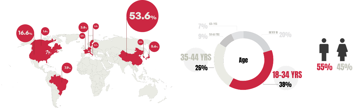
Demographics
Psychographics
Budget Conscious Segment
Who They Are
Students,
young professionals,
gamers with limited income
What They Want
Affordability
value
variety
How to win them
Rental model for new games (no upfront cost)
Free-to-play with optional purchases
Focus on casual & free-to-play genres (indie, puzzle)
Engaged PC Gamers
Who They Are
Hardcore gamers,
Competitors
Who They Are
Extensive libraries,
in-game item ownership
How to win them
Library access through rentals (longer for complex games)
Option to buy & own in-game items
Focus on RPGs, strategy games, MMORPGs
Where we felt the need of understanding the users and find data
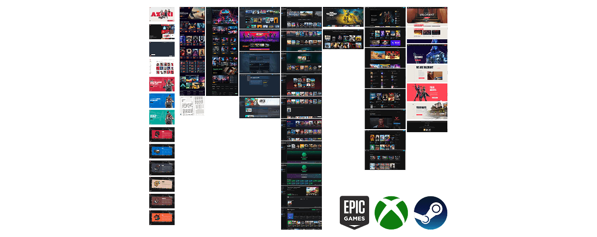
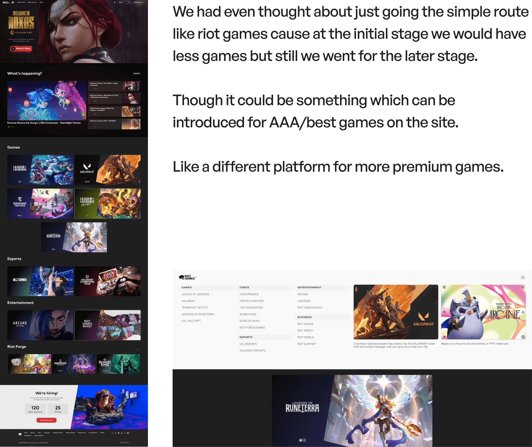
XBOX
a lot of text thrown at you when you click on any game, need more pictures
its easy considering its all on one single page, its simple but way to basic
every page feels the same with no interactive ness.
everything is black and you might think its like any other gaming site. no brand color
overwhelming with too many games, feels way too simple, no star game
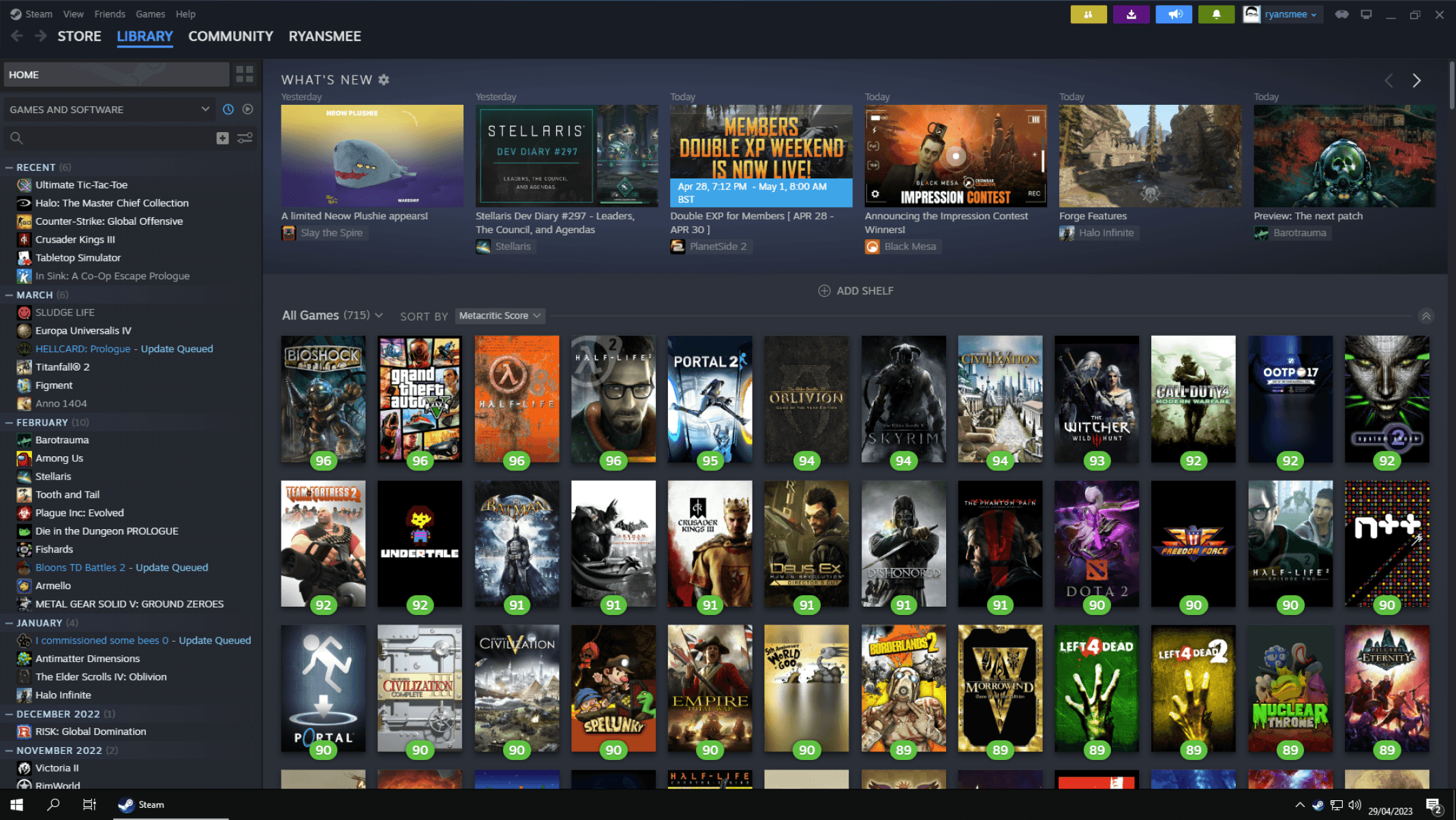
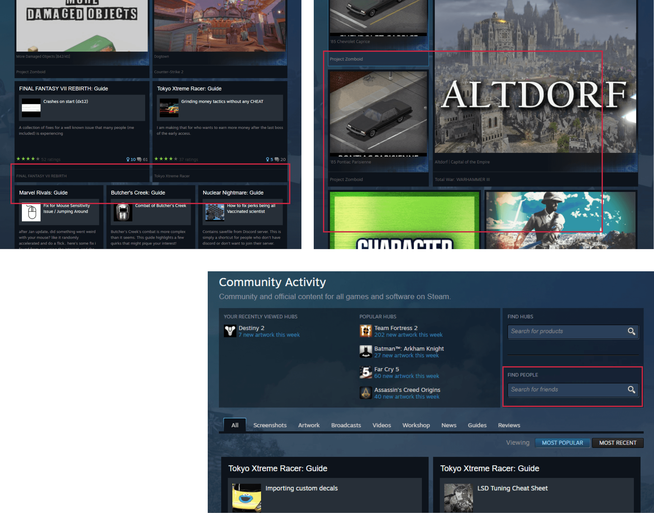
Steam
Users may find the cluttered nature of the store page overwhelming, especially during sales events when multiple games are promoted simultaneously.
Boxy sharp out of trend Design, Very heavy to load.
The top bar disappears when scrolled , hard to navigate u have to scroll back to navigate.
Default previews - no option to disable - too much network consumption and laggy - 2 previews at same time.
its user-friendly interface, making it easy for gamers to navigate through their game library, discover new titles, and access community features.
Interactive Thumbnails and simple design
Epic Games
Limited customization options for users. Can feel cluttered during large sales events.
Limited color palette can feel bland compared to some competitors. Lack of user-generated content can feel impersonal.
Less social features for user interaction. Wishlist’s can be cumbersome to manage. Reviews are not a prominent feature.
Clean and simple layout with easy navigation. Focus on featured games and promotions.
High-quality visuals showcase games effectively. Consistent branding throughout the store.
Easy to find and purchase games. Efficient search and filtering options. Integration with Epic Games launcher for seamless downloads.
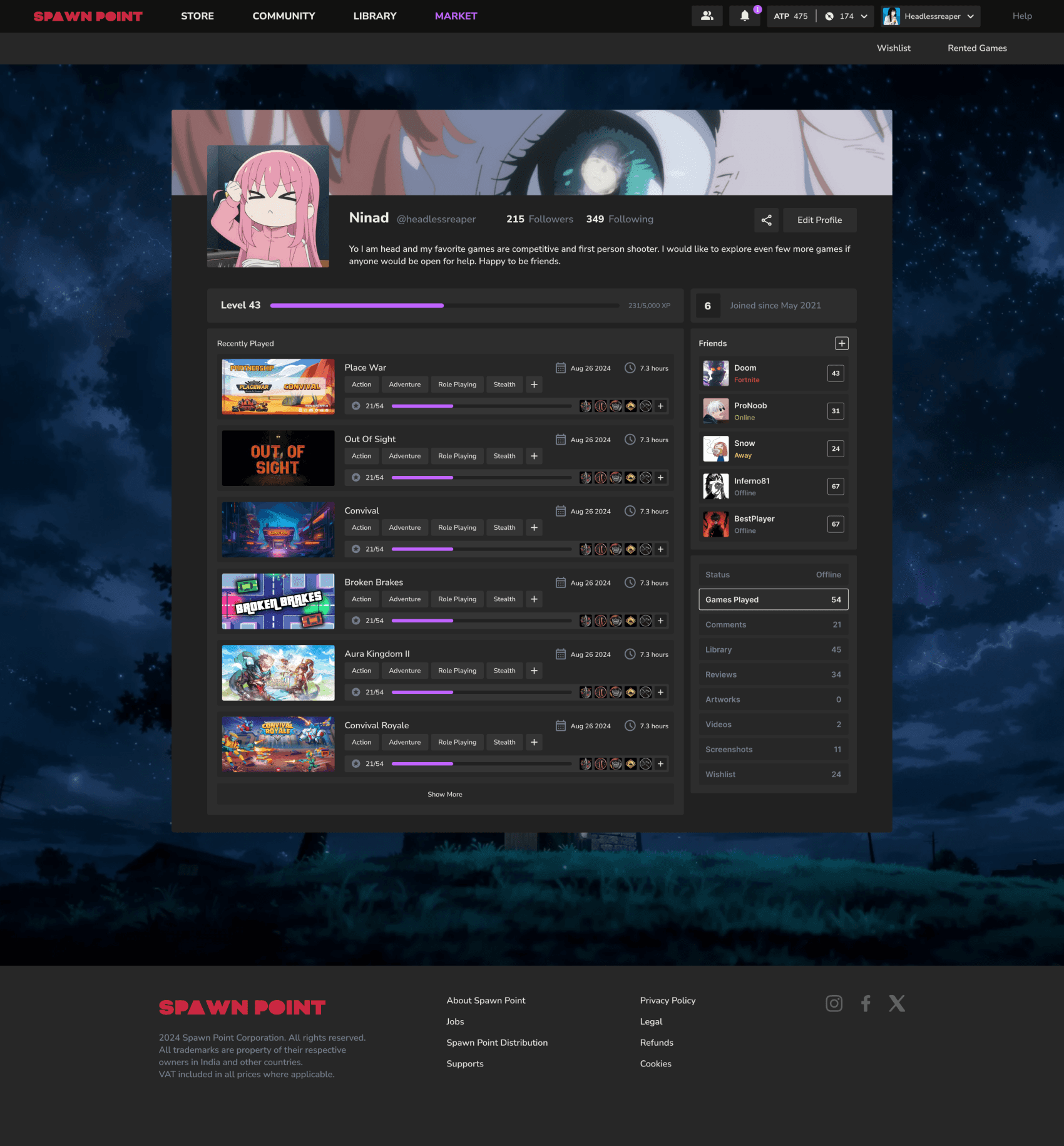
At signup I pick a single character that I’ll use across games — it feels like ‘my identity’ and motivates me to keep playing.
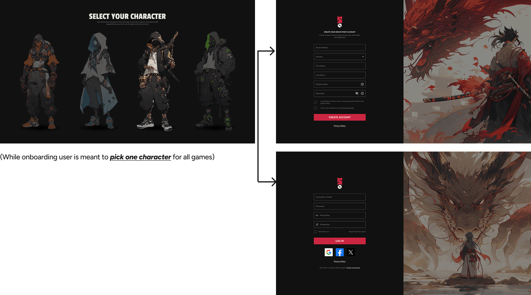
We wanted to keep such a profile picture that will showcase both the character the player has chosen at the start and also the personalized pfp that user has picked.
We also want to introduce characters to level up as the user gains a lot of XP in the future.
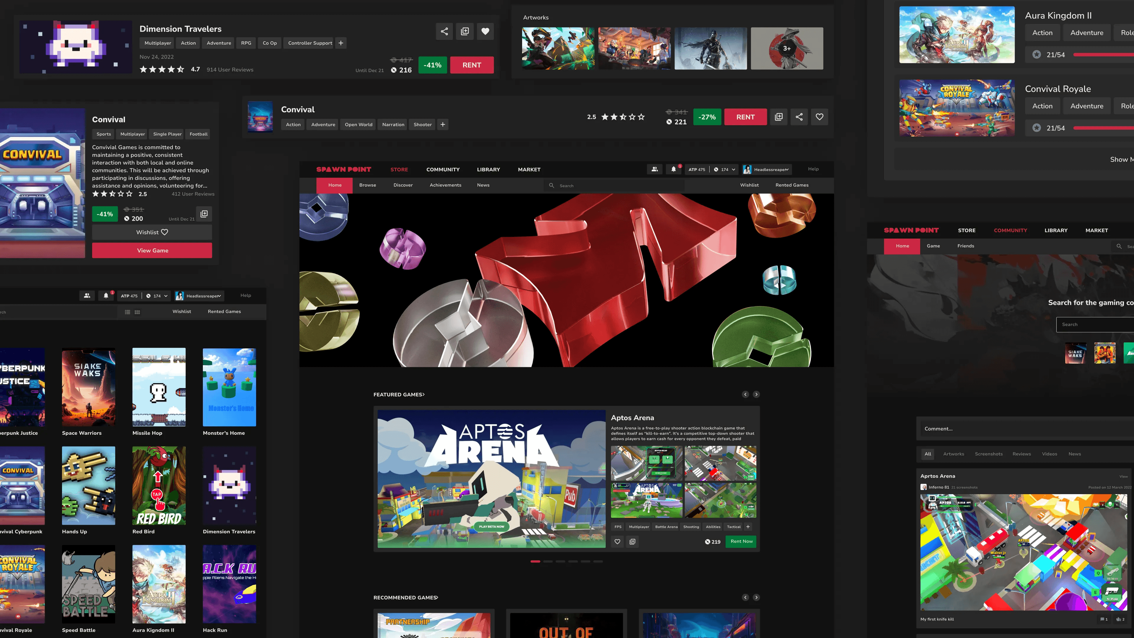
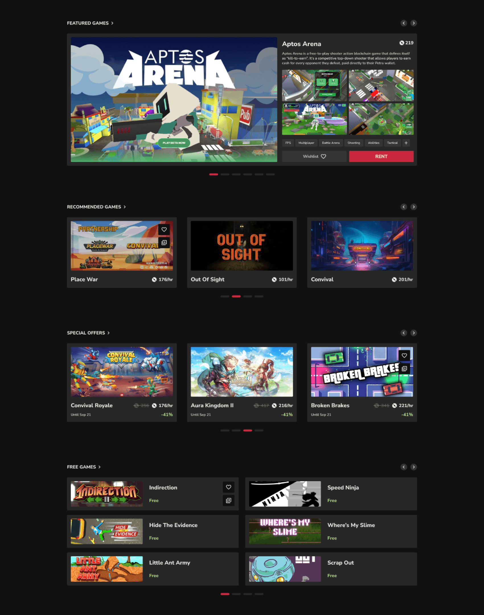
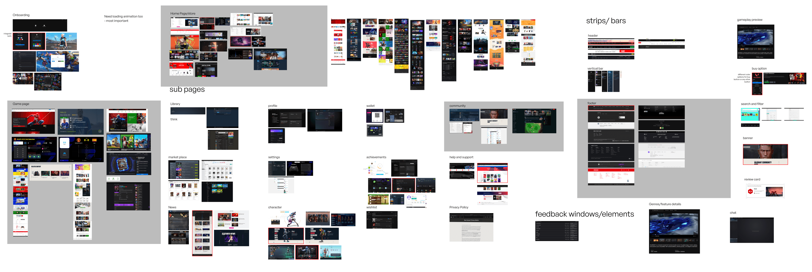
Changes in Home Page
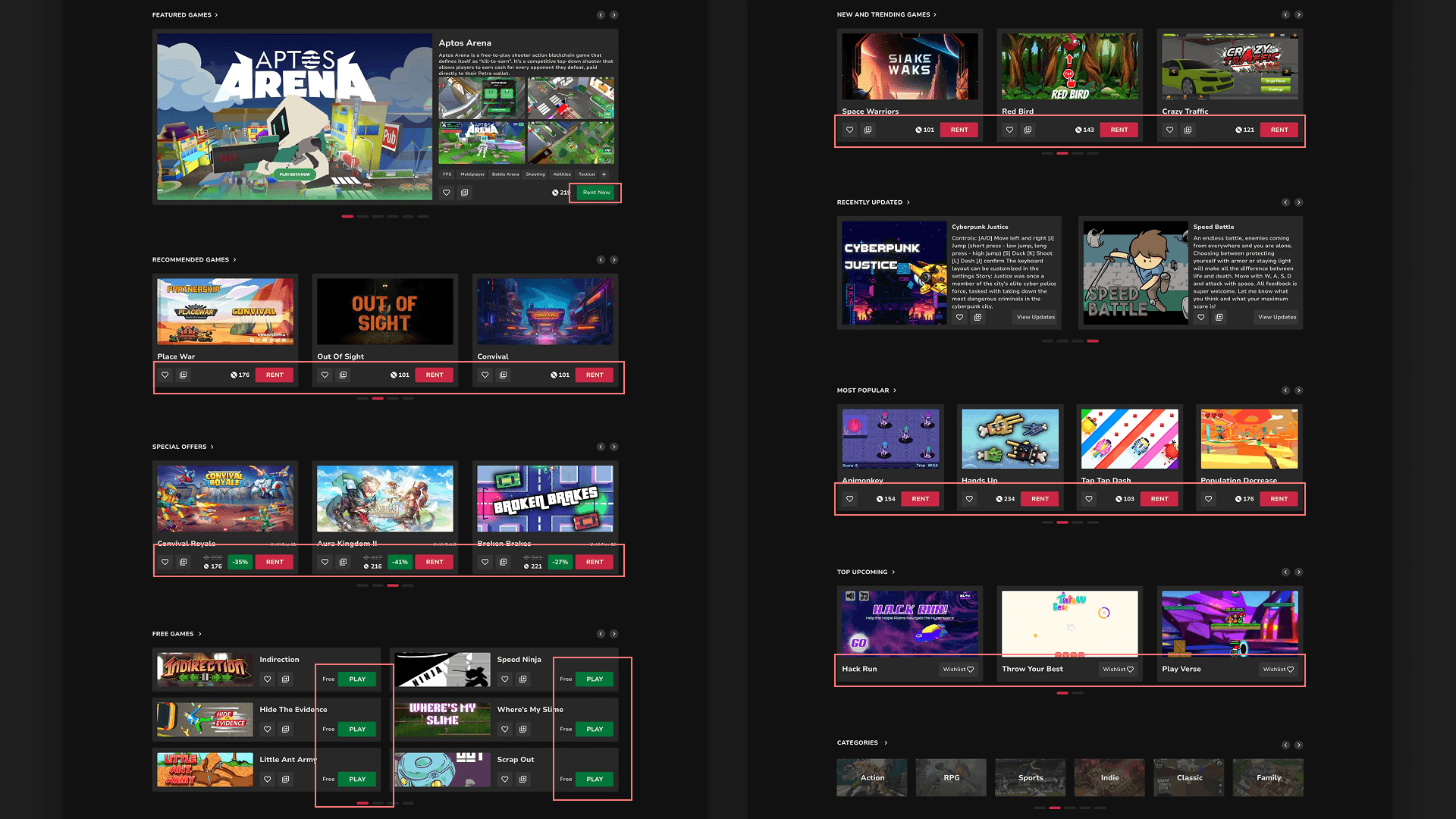
Its also important that the visuals and particularly the graphics and photos support the primary goals of the users or the company
In other words you should not have any visual elements that are their for any other reasons but to look prettier to take out space
We decided to remove the following things from the page:
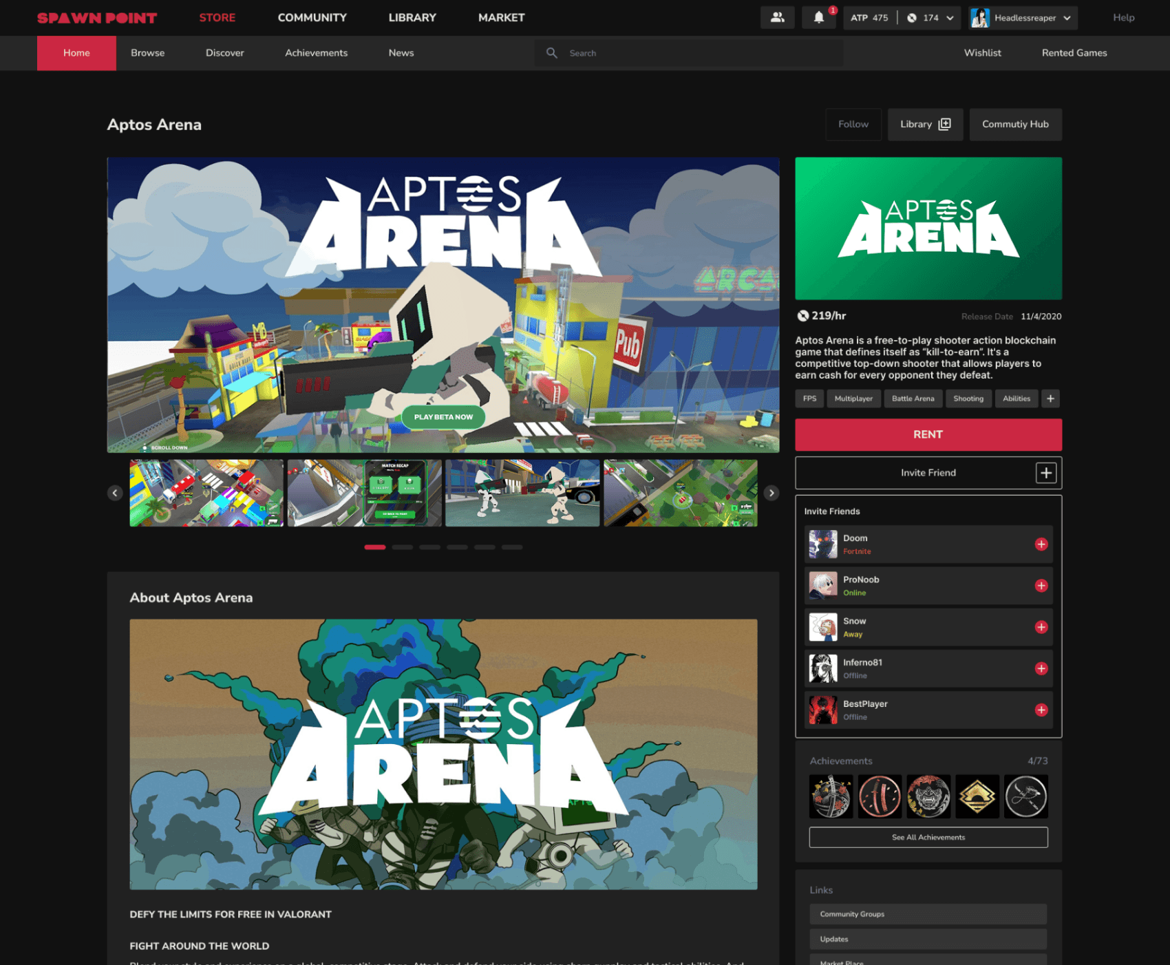
Removed all the RENT buttons cause they were not needed at the first place
Also the Wishlist and Library icon was only made visible when hovered over the card as it was not something user would interact with all the time.
Replaced the pricing of the webpage with /hr so that there is no miscommunication with the user even if it might repeated everywhere.
Hicks Law: More options leads to harder decisions (carousel)
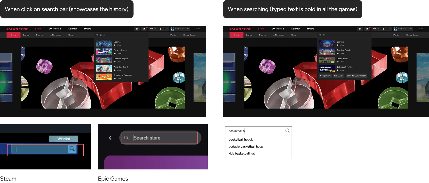
Designing Search Suggestions
One of the biggest problems in both steam and epic games was that when you click on the search tab you can not see what all you had search previously.
Conducted FGD to get get more insights and validate problems
Conducting a Focus Group Discussion
The overall concept of Spawn Point.
User Interface (UI) and User Experience (UX) comparisons between
Steam and Epic Games.
Specific features:
Single character across all games.
Session-based game saving.
Web3 integration within games
Cloud gaming vs. local gaming preferences.
Brand identity preferences.
Desired game genres for the platform.
Interest in custom theme skins.
Insights
Strong focus on user engagement: Features like "What will you play next?" and "Trending" suggest a desire to personalize recommendations and keep users engaged.
Balancing content discovery with user control: Participants liked categorized browsing (scroll or selection) but also wanted a search bar for specific needs.
Visual appeal and clarity: Importance of smooth scrolling, diverse visuals for categories, and a clear layout with categories, trending games, and user library prominently displayed.
Participants
Developers (2-3)
Professional Gamers (2-3)
Designers (1-2)
Spawn Point Stakeholders
Pains
Epic Games: Long loading times, tedious theme installation process.
Steam: Difficulty accessing/managing account settings, clunky search function, tiring login process, although users appreciated the ease of purchase and navigation within sections.
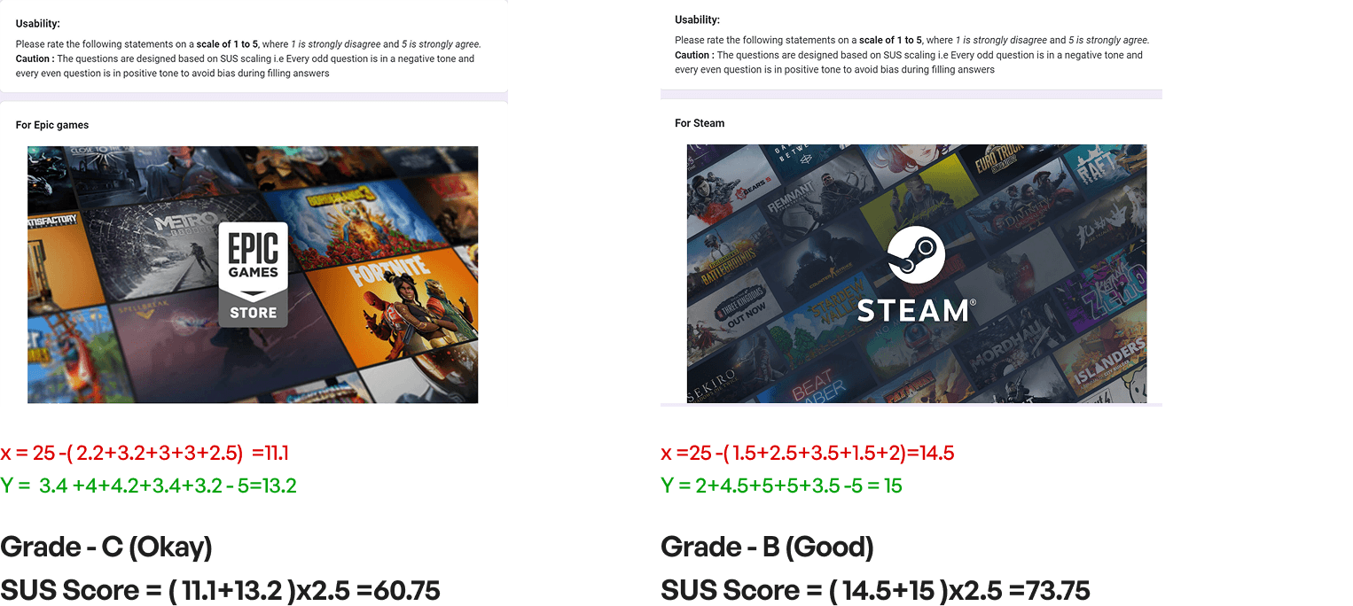
Usability Survey
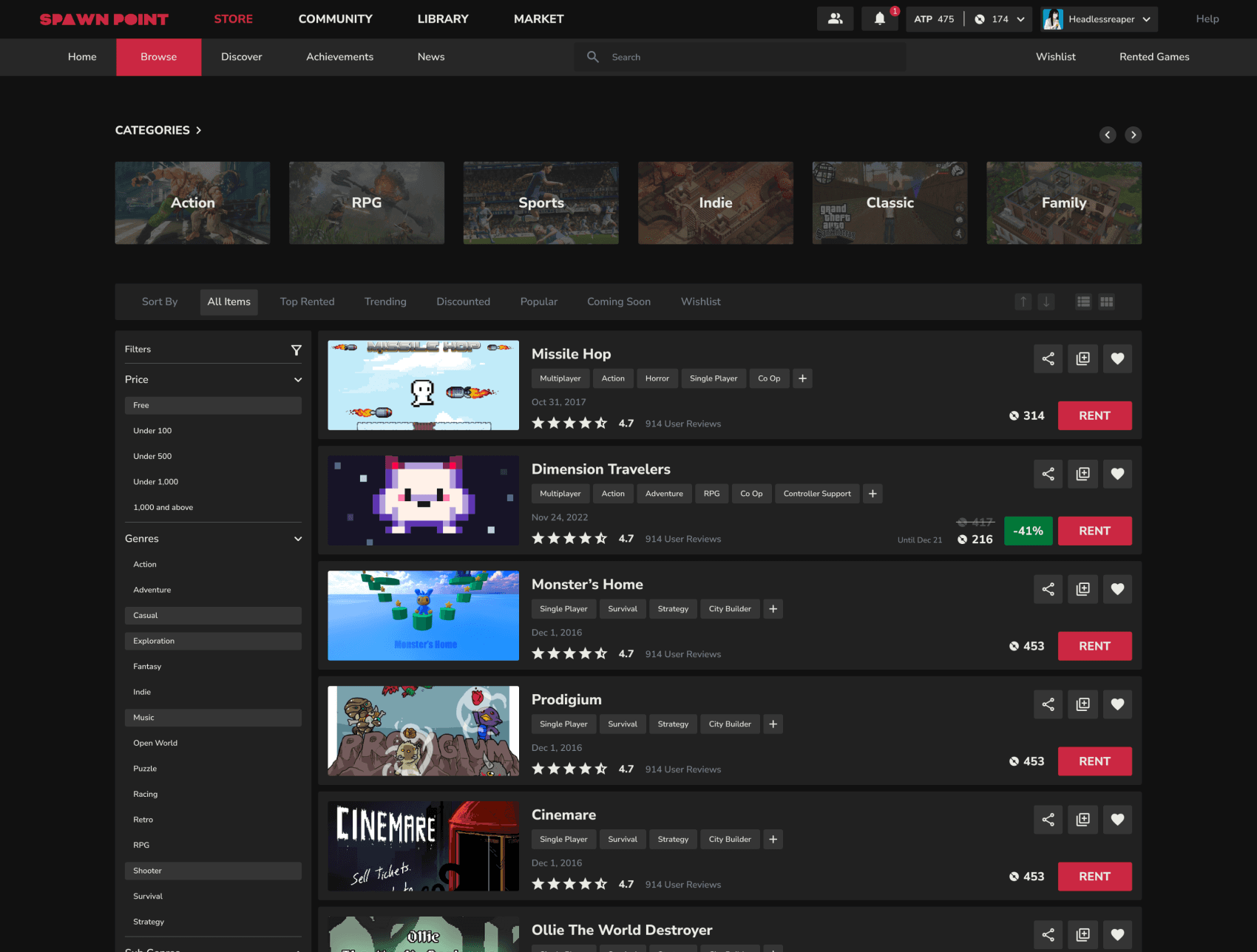
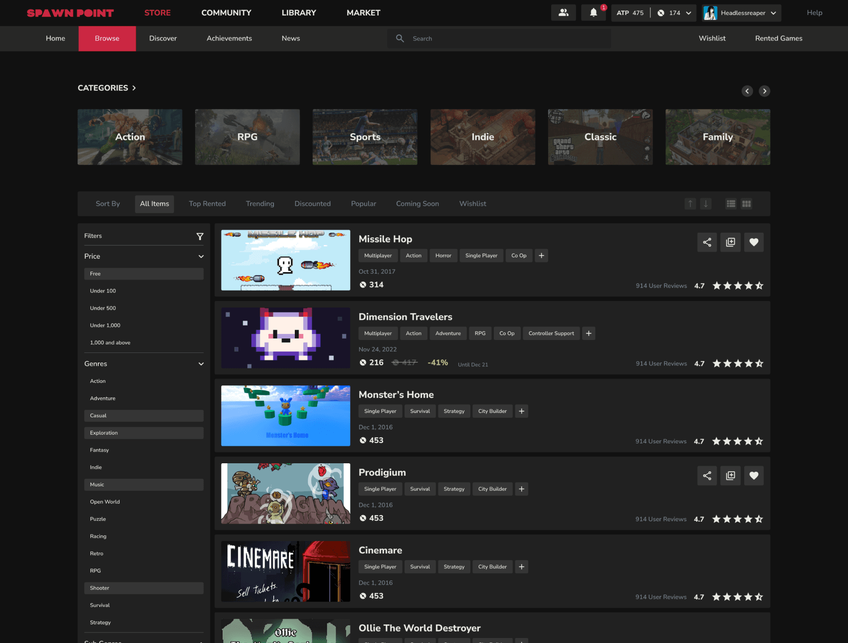
I go to Browse, the search bar is front and center, filters are where I expect them, and cards give me just enough info to decide quickly.
The main thing we knew about the browse page was that we knew how mostly people would come to this page to search games according to their favorite genres/categories. (FGD)
According to that we kept that the main focus and then added all the necessary filters.
Before
First of all again had to clear the big mistake that we had made with the RENT CTA and all the other call to actions.
Made the Wishlist, Share and Library call to actions visible again only on hover state.
After
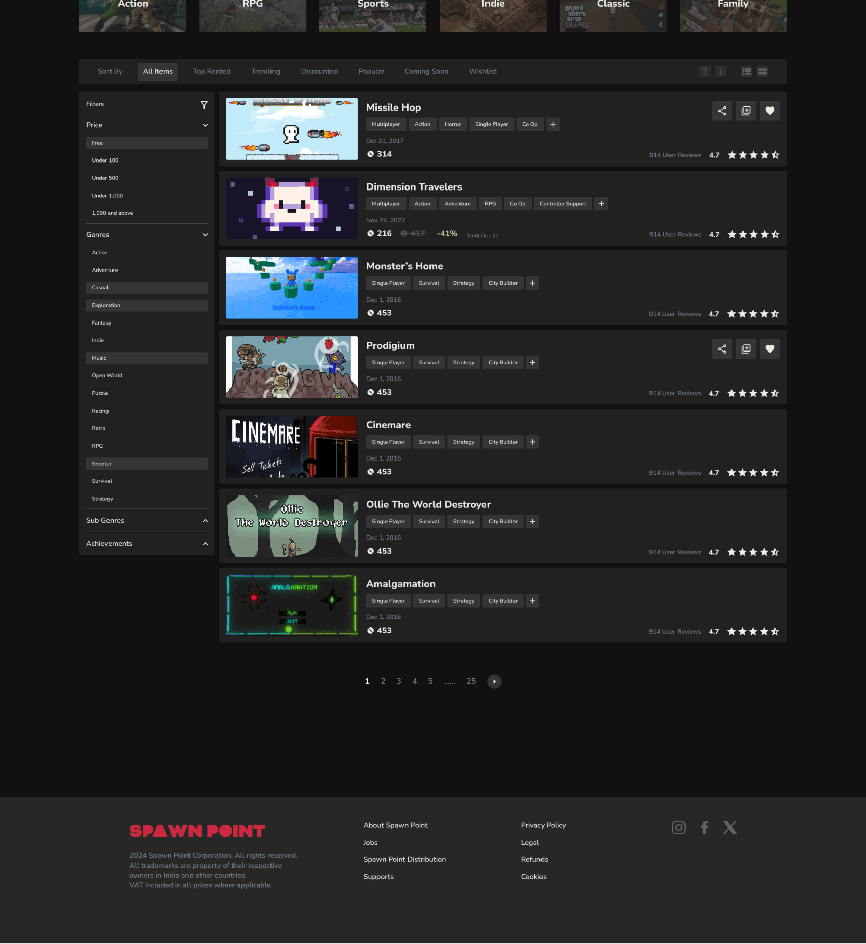
Reasons for not adding a endless scroll even though sites like steam and other sites prefer to do it:
Increased page load
Difficult for the user to compare the games and re find content
Inability to access the footer (and considering how our website is new we would want people to visit our socials and other pages)
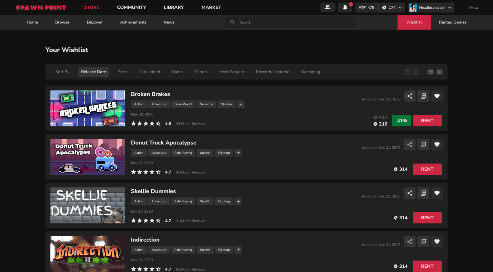
Top wish list were all the games that user might have added with the thought of when they would play the game later on. According to that we had added all the necessary dates in here as to when the game was launched,
Browsing Section
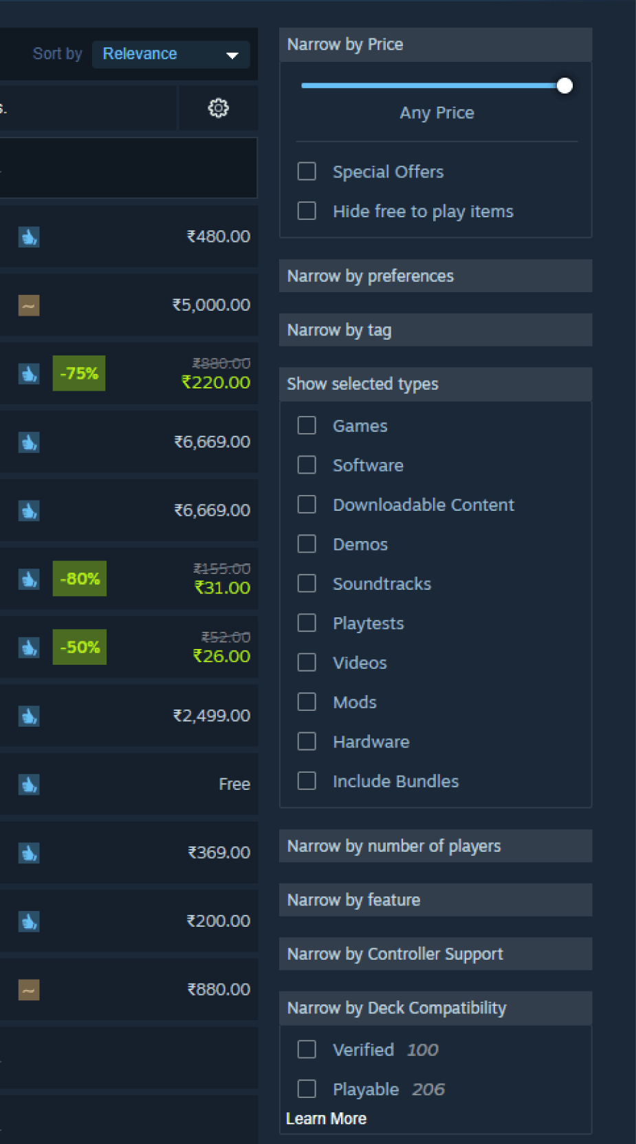
First of all the biggest blunder from steam was to not add arrows for the drop down menu.
Also they are not offering the one of the biggest thing which is which genre a user can pick.
The endless scroll was something interesting they had but we had a different take regarding it.
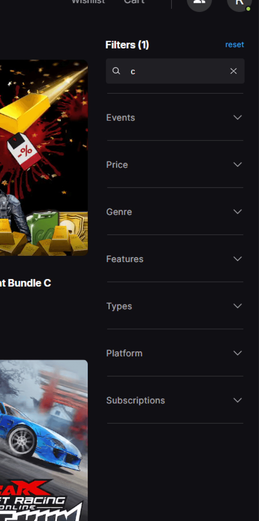
Also one of biggest things that needs to be corrected is that the filters are on the right when most of the site follow a left sided filter.
This goes against the mental model of the user.
Jakob's Law is a principle of user experience (UX) that states users expect websites to work like other websites they've used before.
I click a game tile, I see trailers, screenshots, a short blurb (not walls of text), and a clear rent button, cost and discount info.
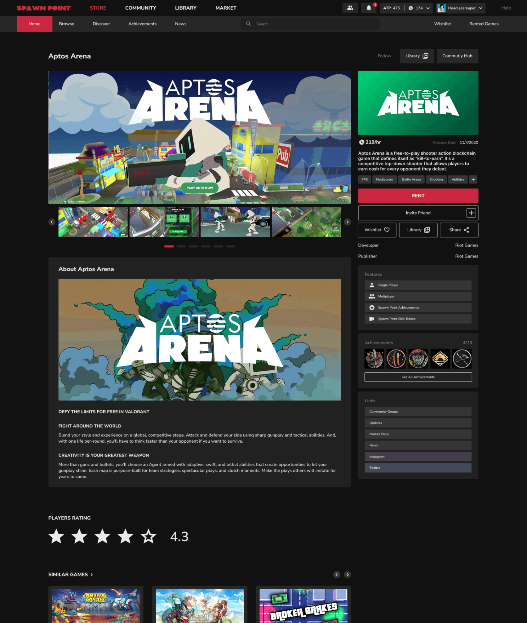
Unlike the major other gaming platforms the goal was to show case the game first to the user for quick decision making.
Showing the trailer and gameplay images makes it easier for the user to decide if he/she should go ahead with the game or not.
Inspiration Board
Card Sorting
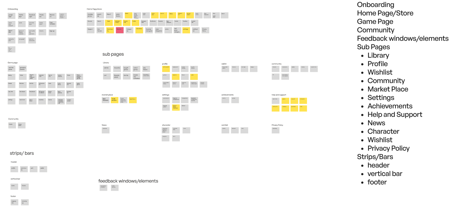
Information Architecture

One feedback that felt like a showstopper
One of the feedback we had gotten was that Steam is more much more preferred than Epic games or other gaming platform cause of its complex UI and how games love it.
We still went against this opinion after a lot of a lot of digging in the field and doing proper research.
Cognitive Load
Research by Sweller (1988) on cognitive load theory shows that excessive complexity hinders comprehension and retention.
Simple UIs reduce mental effort, allowing users to focus on their primary goal—playing and renting games.
Different opinions we had while iterating
One of the thing we wanted to introduced was the side for just for the distinction from other sites and people for people to focus more on the games instead of being distracted from other buttons.
I rent for one hour, the checkout is clear, Spawn Coins are presented in small, tempting prices, and the promo for early users discounts me.
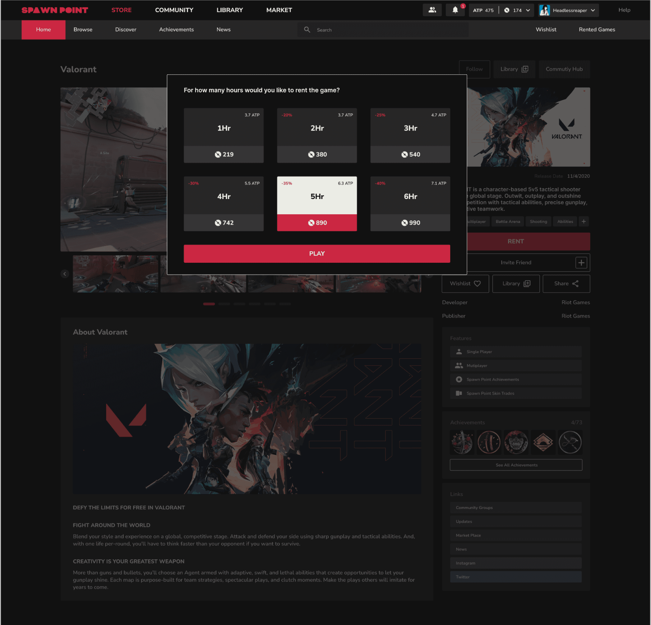
Decreasing the Price as we go down the ladder of renting the game per hour.
Showing them how much ATP it costs them at the current rate.
Also adding the discount percentage to make better decisions
Making inner purchase seem like they are cheap by them buy a lot of spawn point coins for small amount real currency but the in game purchase remain in tact.
Money illusion: Players might overspend on virtual items due to the illusion that larger quantities of virtual currency offer better deals, even though the real value is the same.
Transaction utility: Players might be drawn to deals based on their perceived value (e.g., buying bundles with bonus items) rather than the actual utility of the items themselves.
Between rounds I open Community, I can toggle ‘For you’ and ‘Friends’, follow game communities, and quickly reach the posts of my top 5 games.
The community tab currently in steam is scattered and its hard for the eye to follow every post. Some posts are small and some are way too large. There is no specific size metric that is followed.
There is no easier way to filter out the friends posts easily in the community tab itself.
You are suppose to search the name too while we could have made it 1-2 clicks away.
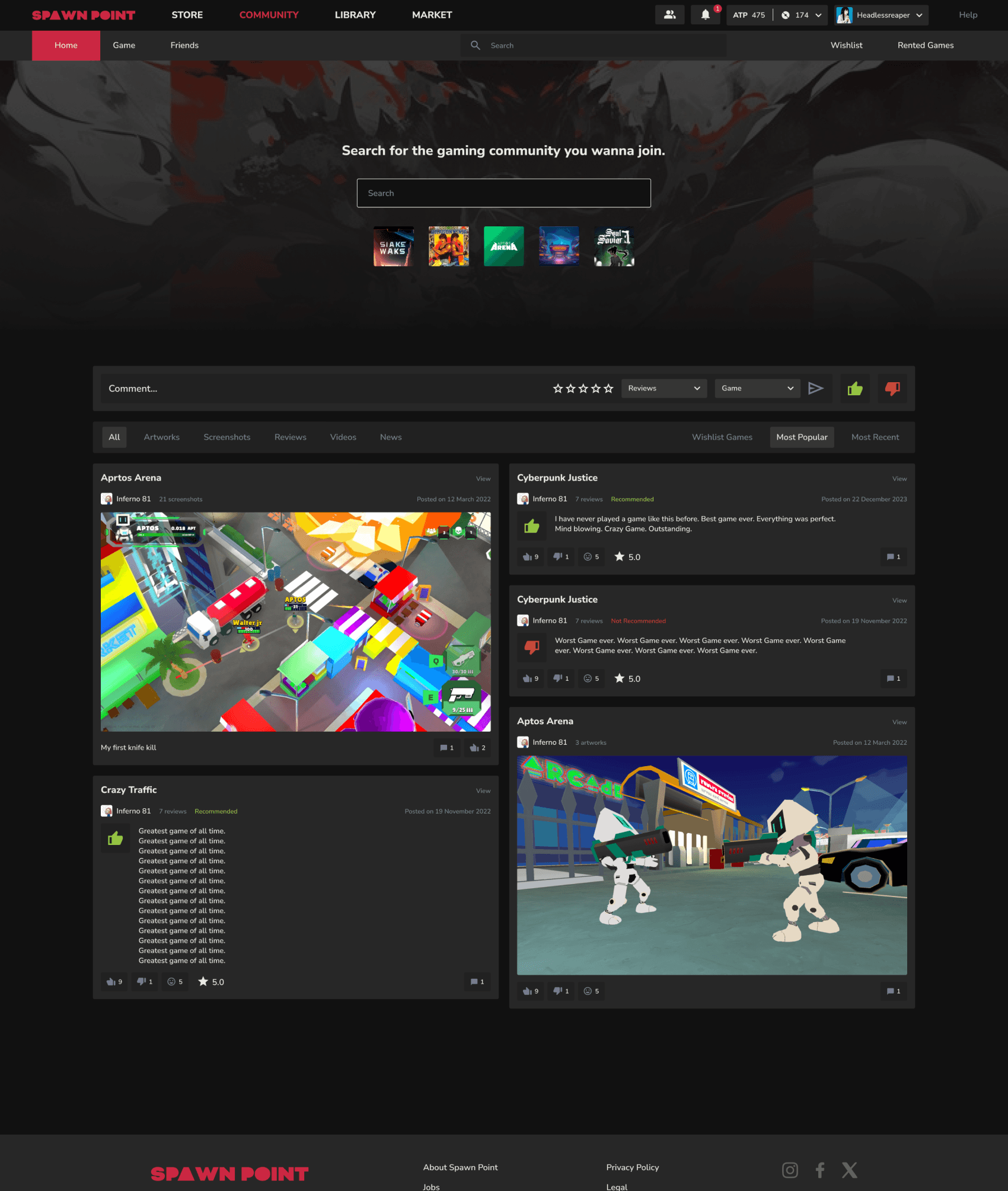
While people love to explore game we observed them most of them have their 4-5 to game which they love and play them repeatedly.
So according to that we kept their top 5 games accessible below the search bar so that they could go to the community of their game even quicker.
While posting you can change the category and game according to your preferences.
Users could switch between different types of tabs according to their preference.
Plus I think this is something we can do more research on what should be the order of these tabs according to the user preferences.
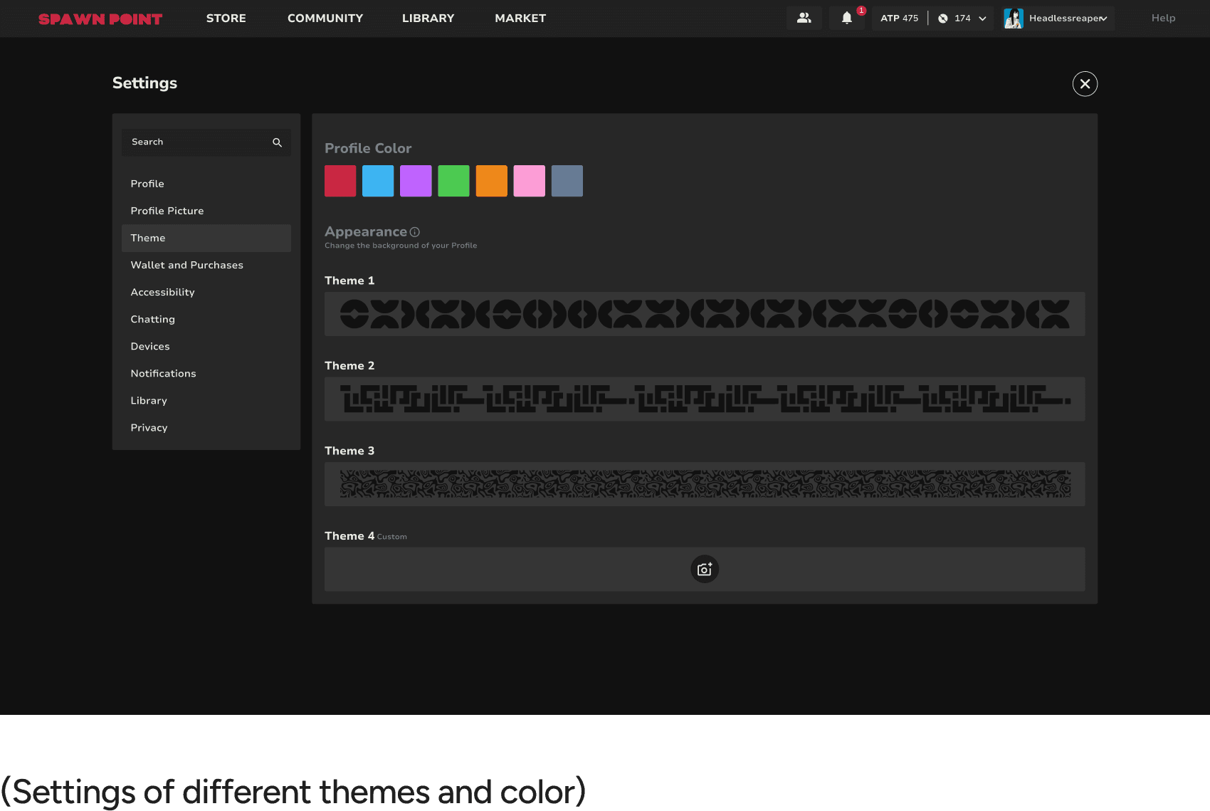
I tweak my theme, I can set a custom background but it’s automatically darkened 40–50% so text remains readable. Settings are easy to find.
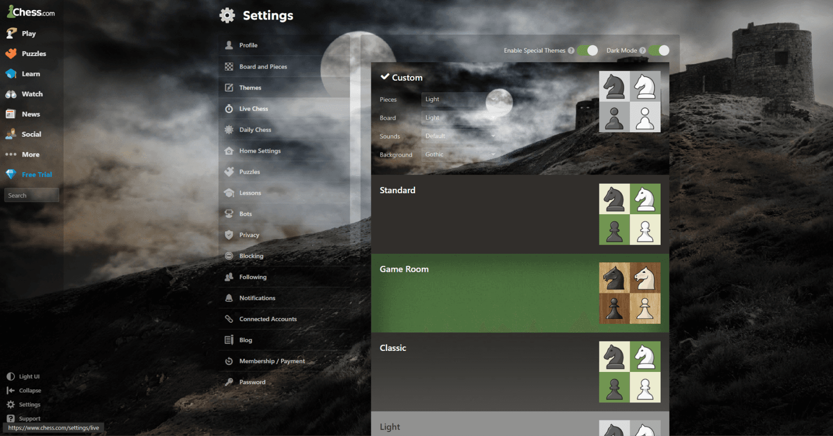
Even for example in Chess.com while they did allow to add custom background across the websites they did not work on the brightness of the BG which results in people not being able to read the text carefully.
One of the thing I decided upon was that even if we allow people to change the background we would automatically make it darker by 40-50% so that readability is not gone for a toss and also the brand image of the website still stays in tact.
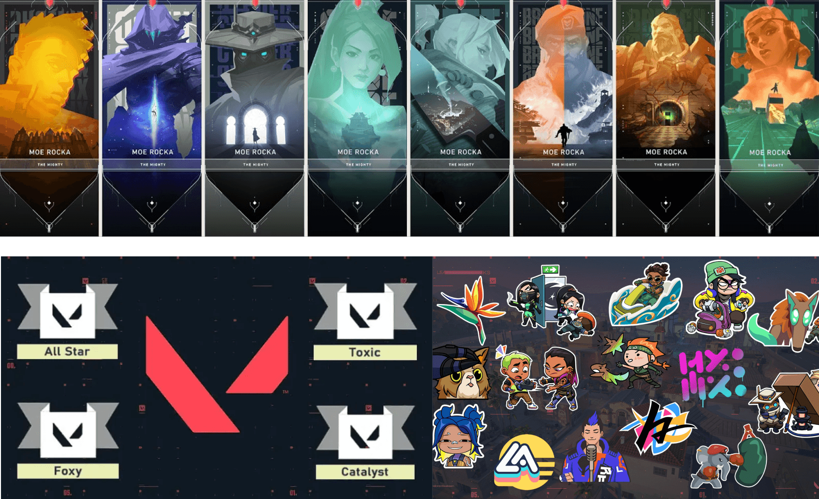
Even in Valorant for example they had different cards, sprays, titles which people could showcase.
With a character system like ours one of the visions which we could take forward was to introduce such things which we could either monetize or people would get these unique rewards through grinding games for long hours and unlocking them after every stage.
When we got the answer but the felt the need to dig deep
One of the most important insight for user retention we had found out was personalization features from FGD.
We decided to dig deep into what all could be provided to make people distinguishable as well as ear profit maybe if possible on the side.
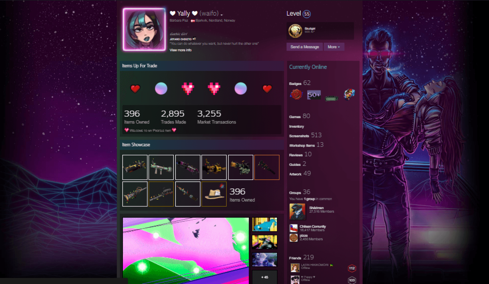
In Steam their major focus was that they wanted their uses to be able to change the whole color theme so that it could even match the background which they are going to set.
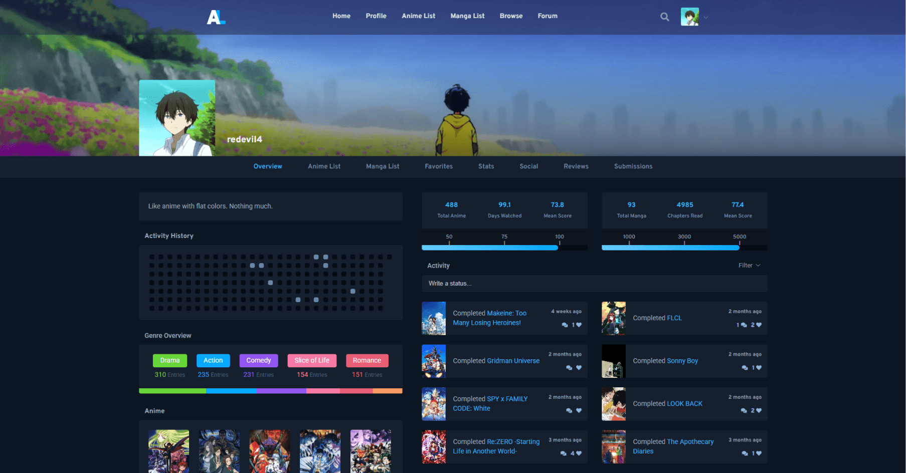
But for example in Anilist they went with a very minimalistic approach of only changing colors for small portions of the UI. This could even benefit companies which are in an early stage and want to do quick changes too for the user.
One of the biggest pointers we got from the FGD we had conducted was how important personalization was users. Someone had pointed it out and we had to absolutely introduce it.
One of the inspiration even was how Anilist plays with the colors slightly used and how chess.com allows you to play with the background.
Again a reminder that for a detailed overview you can visit this presentation deck


